Turning a charity into a recognisable brand
Industry
Charity
Client
The Shakespeare Hospice
Developing a visual identity
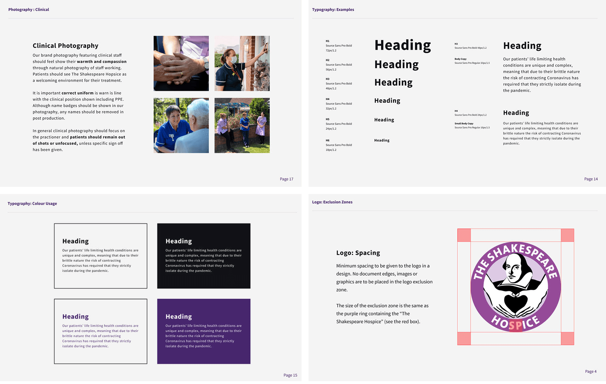
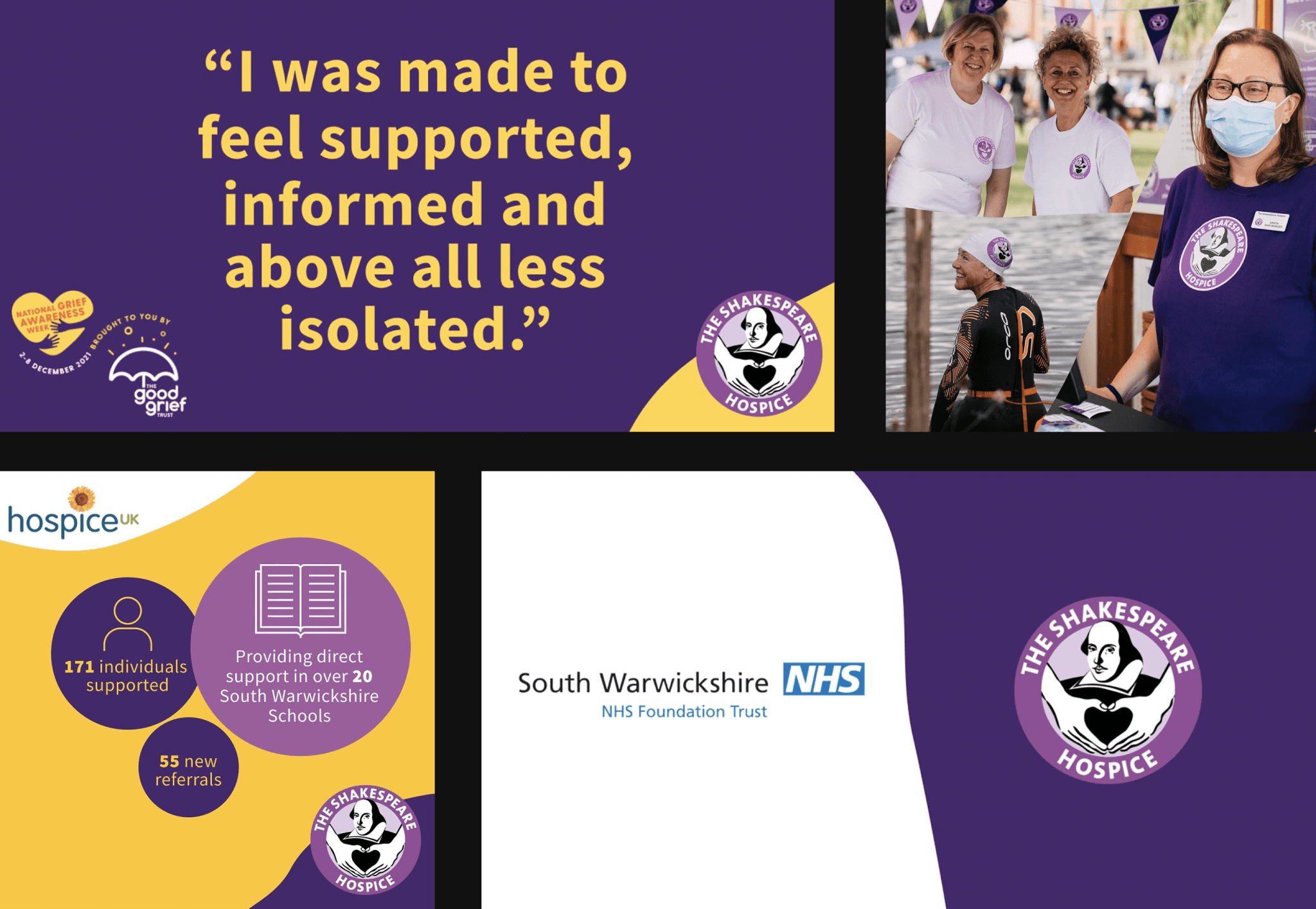
The Shakespeare Hospice offers outstanding palliative and end of life care to patients, their families and carers across South Warwickshire. The charity has a fantastic supporter base within the local community. I've worked with the Income Generation Team to build a visual identify across print and digital, including developing a full set of brand guidelines.When I joined the The Shakespeare Hospice the marketing output varied from project to project. From day one I consolidated the typography and colour usage to make sure the marketing output became recognisable and consistent. Following that I developed a full set of brand guidelines for the charity, including logo usage, colour pallet, typography, brand-voice and photography guidelines. The Hospice offers care for patients and families with a range of different abilities so accessibility was key across brand guidelines. We focused on using legible fonts, contrast, simple language and well structured URLs.


Connecting with supporters
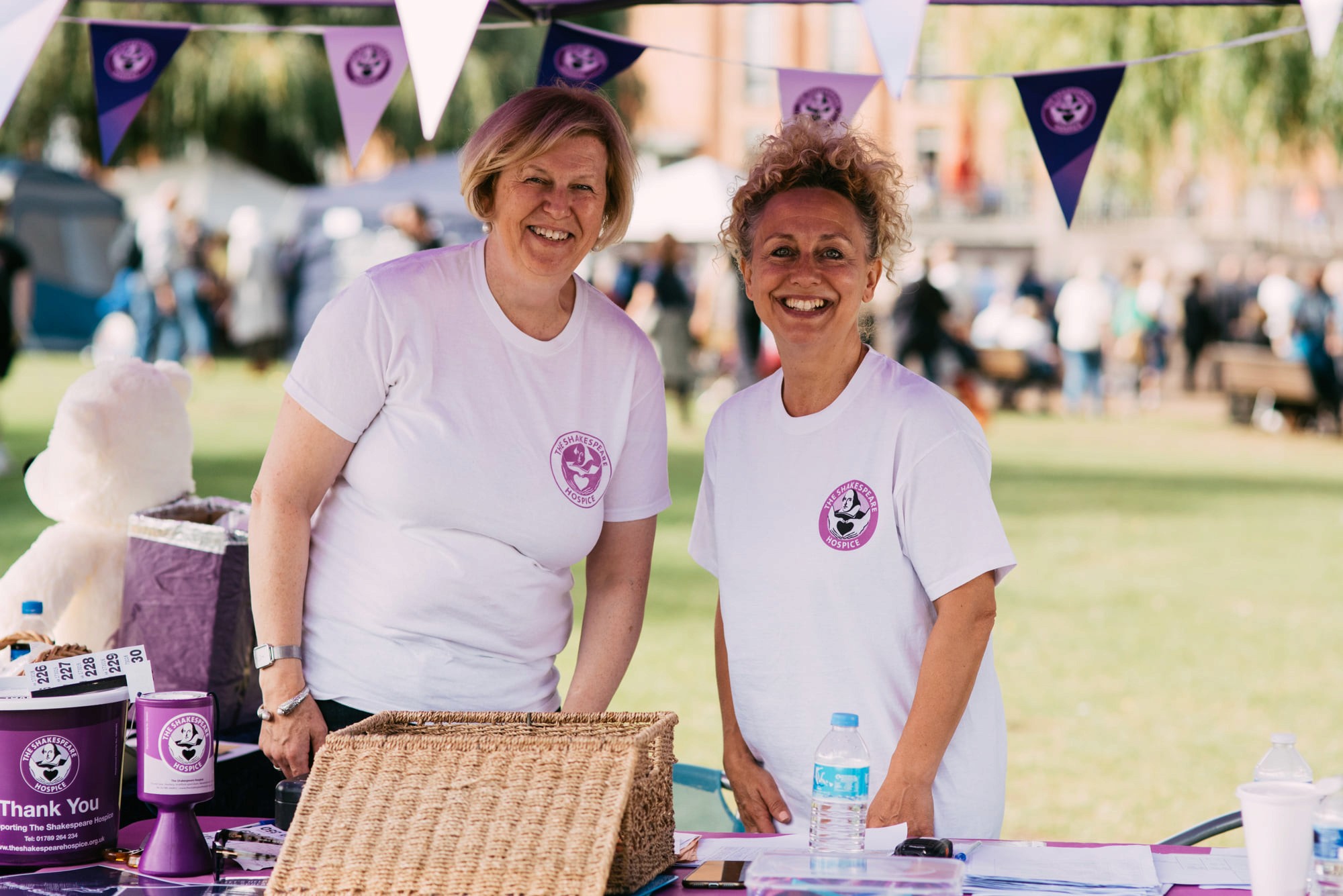
I've worked on the charities social media including Facebook, Instagram, Twitter and LinkedIn, creating bespoke content across each channel to connect with their audience. I've worked on photography and videography to capture fundraising events, clinical updates and marketing campaigns. We've put more focus on using motion graphics on our campaigns, expanding our audience and creating greater user engagement with our supporters. Using video content allowed the Hospice to connect with a younger audience which has been a more difficult demographic to involve with the charity.

